
Today it's all about storytelling and infographics and visuals are a key part of that. All researchers want to connect the reader with the data and that's what data visualization's and storytelling can do
~Derek Richar
Honestly, not everyone has the time in life to analyze each and every data point and extract it's significance and in combination with other data points, become aware of the bigger picture, whether it be the trend of a wildspread virus, or the income statement of a company or literally the interest of people in a certain programming language over pizza 😂

Everything is so data driven these days, that the need for interactive visualizations that help even non-mathematicians to understand trends, is of paramount importance

This is what this article will be about today. Not about libraries and frameworks and programming. Just about designing effective data visualizations (aka data vizes) in a beautiful manner, down to the most intricate details, such that the next pie chart you create will leap from the pages and tell the viewer a story !
Basic theory...
There are primarily just these 3 types of data vizes :
| TYPE | ROLE |
|---|---|
| 1. TABLES | To show separately indexed data in a systematic format |
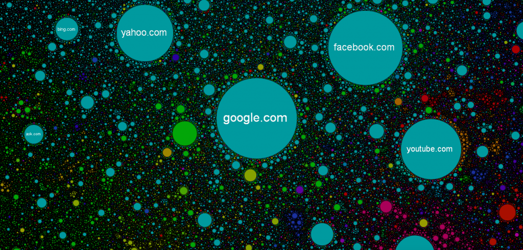
| 2.NETWORKS | To display connected data in the form of lines connecting data points |
| 3. SPATIAL | To represent geographical or other areal data points in their raw form by giving importance to position/actual geo-location of data point |
Also, there is the basic notion of marks and channels that just help us understand which sort of graph is the most accurate for our use case

MARKS AND CHANNELS

Marks
These are basically rows aka items aka entries in your database that you'll consider and use the attributes as properties whose quantities you wish to assess in several different ways (eg : over time, relative to other entries etc.) axis and plot your viz.
Channels
These are columns aka attributes each mark in your database is associated with and it is these properties that we wish to study of a single or multiple item(s) in the database with the help of vizes
These are divided as follows
| TYPE | MEANING | EXAMPLE |
|---|---|---|
| Categorical | Comparison of same attributes of items in the database but different categories |
Comparing the oil prices(Y-Axis) of India, China and Japan over time |
| Ordered : Ordinal | Comparison of like attributes of a discrete form in same category |
eg : S, M, L, XL sizes in a T Shirt |
| Ordered : Quantitative | Comparison of like attributes of a continuous form |
eg : Spread of a virus over time |


Use cases
Following are the use cases of application of our marks-channels that I learnt while following this brilliantly taught dataviz course


Picking your graph....
For this one, I actually read through this amazing writeup with examples for picking a suitable template and injecting the most apt graph for your use case in it.


Next steps ...
Congratulations ! You have now mastered the most basic fundamentals that give you mastery over conveying your data in the most engaging manner possible !
Technology has provided us with so many amazing tools for dataviz that we honestly can't keep track of it. Nevertheless, as long as you get the basics right, all your charts and graphs will be on point !

If you wish to explore this domain more, I would highly recommend you to read my blog on creating a simple bar chart with Next JS and D3 JS, 2 JS based libraries that integrate together brilliantly to make next level performance enhanced, interactive datavizes
 Ankit Sanghvi
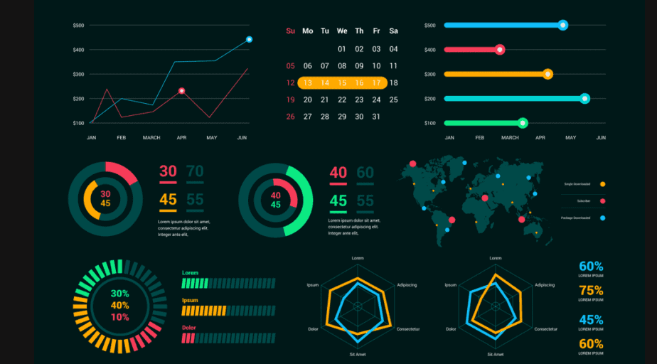
Thanks a lot for reading this content and I really wish you the best of luck on your journey to becoming a dataviz ninja ! Until next time....🥷