Talk about a match made in heaven 🚀
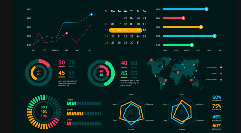
D3 and Next are the perfect combination for seamlessly creating reusable, extensible and component-driven interactive dashboards that can be used in literally any industry you can imagine.
With Next JS we can weild the high speed and performance powers to make the UI/UX even more pleasing due to prefetching of all the data that the dashboard is populated with. To learn more about Next JS, refer to my blog here :
 Ankit Sanghvi
What is D3 ?
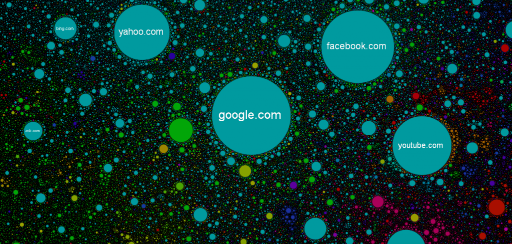
Data Driven Documents JS aka D3.js is a javascript library to render the amazing charts based on data. It can be used to:
- Visualize charts
- Find patterns
- Show the comparison between two or more time-series data
- Draw the data in real time as it happens (for e.g. data generated by various sensors or internet traffic)
- Generate cool dynamic art on webpages. It just depends on user's imagination
“D3 helps you bring data to life using HTML, SVG, and CSS. D3’s emphasis on web standards gives you the full capabilities of modern browsers without tying yourself to a proprietary framework, combining powerful visualization components and a data-driven approach to DOM manipulation.”
~d3js.org
But how does D3 work ?
Well, charts are based on information coming from third-party resources which requires dynamic visualization during render time. SVG is a very powerful tool which fits well to this application case.
What is SVG ?
SVG stands for Scalable Vector Graphics which is technically an XML based markup language.
It is commonly used to draw vector graphics, specify lines and shapes or modify existing images. You can find the list of available elements here.
Pros:
- Supported in all major browsers;
- It has DOM interface, requires no third-party lib;
- Scalable, it can maintain high resolution;
- Reduced size compared to other image formats.
Enough talk, let's get this party started....
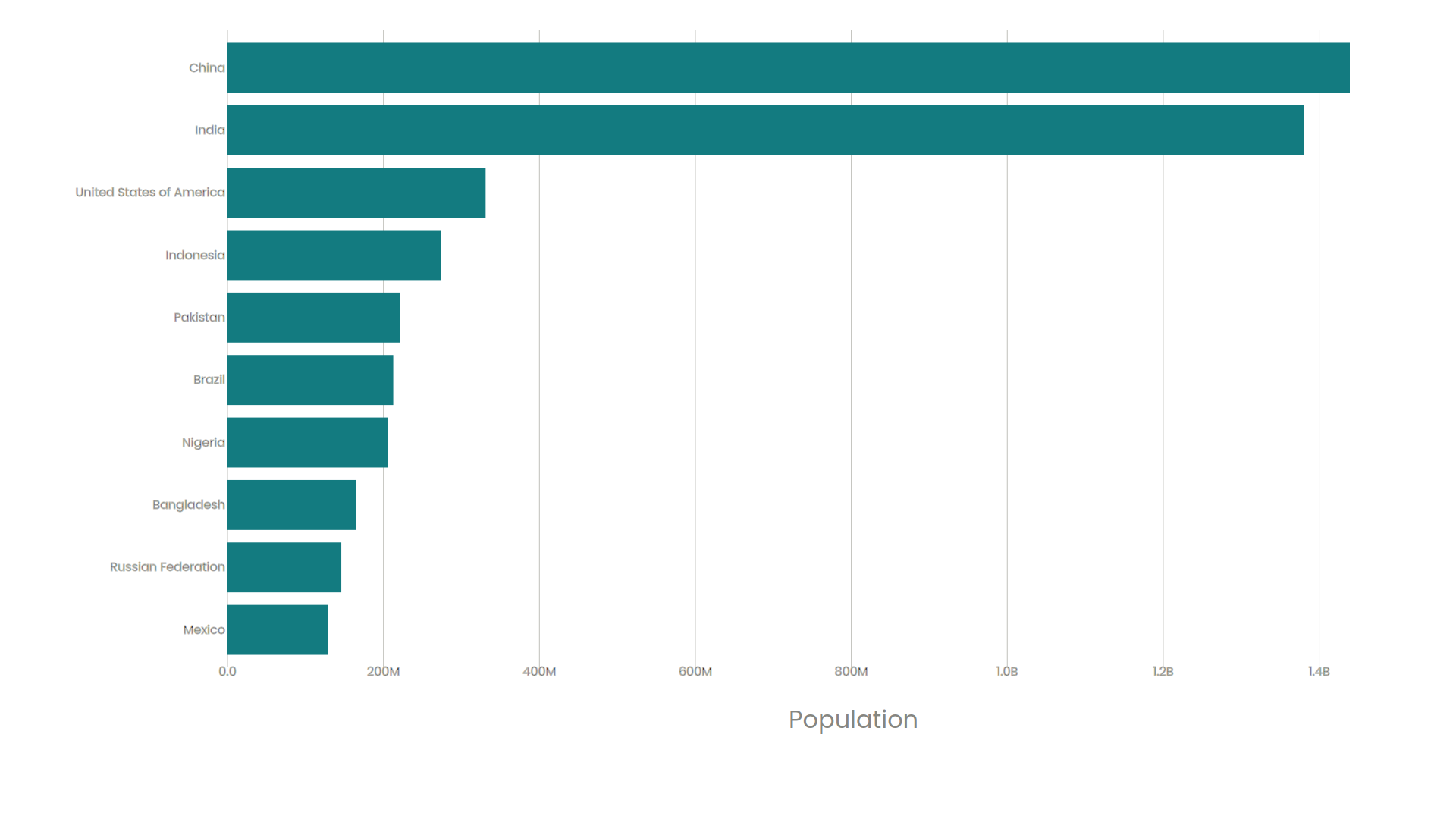
Here, we are going to build a very simple data visualization using D3 and Next JS that shows the population of the 10 most populous countries in the form of a simple horizontal bar chart
Resources
The code for this app has been properly committed and document by me in this GitHub repo for your perusal
 crew-guy
Data Fetching
Start by initializing the Next JS project and adding the D3 js NPM package
npx create-next-app population-chart
npm i d3
The data for all this visualization has been easily made accessible by me on this GitHub Gist, feel free to explore and tweak it; else just use the URL below in your project
GitHub Gist
262588213843476
Direct URL
I have abstracted all the logic for data prefetching in - src/helpers/fetchData.js. Here, we have used the d3.csv() function to parse the data as per my liking and just extracted 2020's population for the top 10 most populous nations
import * as d3 from 'd3'

export const fetchData = async() => {
    const csvUrl = "https://gist.githubusercontent.com/crew-guy/e1ae0b5db6ace5eda68bc8fb9e903576/raw/UN%2520World%2520Population%2520Dataset%2520-%2520Sheet1.csv"

    // Using d3.csv()
    const row = (d) => {
        d.Population = +d['2020']
        return d
    }
    const fullData = await d3.csv(csvUrl, row)
    const data = fullData.slice(0,10)
    const text = d3.csvFormat(data)
    return data;
}Creating the Chart from the Data
For this part, I have simply used the component development tech to create separate components for the data marks and both the axes and just integrated it all, along with the data fetching logic in my landing page file Next JS
| Filepath | Function | |
|---|---|---|
| AxisTop.js | ./src/components/AxisTop.js |
Logic for the X-Axis (showing population count) marks |
| AxisBottom.js | ./src/components/AxisBottom.js |
Logic for the Y-Axis (showing population country) marks |
| Marks.js | ./src/components/Marks.js |
Location of the actual plot points on the graph |
| index.js | ./pages/index.js |
File that integrates all these above components into 1 single chart |
export const AxisTop = ({xScale, innerHeight, tickFormat}) => (
    xScale.ticks().map(tickValue=>(
            <g className="tick" transform={`translate(${xScale(tickValue)},0) `} >
                <line y2={innerHeight} />
                <text
                    key={tickValue}
                    style={{textAnchor:"middle"}}
                    dy='0.71em'
                    y={innerHeight}
                >{tickFormat(tickValue*1000)}</text>
            </g>
        ))
)export const AxisBottom = ({yScale}) => (
yScale.domain().map(tickValue=>(
<g className="tick">
<text
key={tickValue}
x={-3}
style={{textAnchor: 'end'}}
dy="0.32em"
y={yScale(tickValue) + yScale.bandwidth()/2}
>
{tickValue}
</text>
</g>
))
)export const Marks = ({data, xScale, yScale}) => (
data.map(d => (
<rect
x={0}
y={yScale(d.Country)}
width={xScale(d.Population)}
height={yScale.bandwidth()}
/>
) )
)import Head from 'next/head'
import styles from '../styles/Home.module.css'
import * as d3 from 'd3'
import {useState, useEffect} from 'react'
import {scaleLinear, scaleBand, max, format} from 'd3'
import {AxisTop} from '@components/AxisTop'
import {AxisBottom} from '@components/AxisBottom'
import {Marks} from '@components/Marks'
import {fetchData} from '@helpers/fetchData'
export default function Home({data}) {
const [height, setHeight] = useState(0)
const [width, setWidth] = useState(0)
useEffect(()=>{
setHeight(window.innerHeight-100)
setWidth(window.innerWidth-100)
},[])
const margin = {top:40, left:300, right:40, bottom:60}
const innerWidth = width - margin.left - margin.right
const innerHeight = height - margin.top - margin.bottom
const xVal = d => d.Population
const yVal = d => d.Country
const yScale = scaleBand()
.domain(data.map(yVal))
.range([0,innerHeight])
.padding(0.2)
const xScale = scaleLinear()
.domain([0, max(data,xVal)])
.range([0, innerWidth])
const xAxisLabelOffset = 40
const siFormat = format(".2s");
const tickFormat = tickFormat => siFormat(tickFormat).replace('G','B')
return (
<svg width={width} height={height}>
<g transform={`translate(${margin.left},${margin.top})`} >
<AxisTop xScale={xScale} innerHeight={innerHeight} tickFormat={tickFormat} />
<AxisBottom yScale={yScale}/>
<text
className="axis-label"
x={innerWidth / 2}
textAnchor='center'
y={innerHeight + xAxisLabelOffset}
>Population</text>
<Marks data={data} xScale={xScale} yScale={yScale} xVal={xVal} yVal={yVal} />
</g>
</svg>
)}
export const getStaticProps = async () => {
const data = await fetchData()
console.log(data)
return {
props:{
data
}
}
}In the main file, I have used the scaleBand, scaleLinear and max functions from d3 to setup the scale and the axis of the overall rendered SVG chart.
Also, I have written the getStaticProps( ) function to prefetch all the data (as defined in the code in the fetchData.js file) in advance for a performance boost.
Apart from that, this is just pretty basic React JS logic on rendering components using the array of data fetched
Thus, the final rendered chart looks like this !
Afterthought
This is just the sliver of the beginning of we can craft powerful and completely customized data visualization by the wielding the holy trifecta - D3, Next and SVG
There are no limitations to what you can create now. Maybe the next big stockbroking platform or the next Google Trends will be yours. Who knows ?
If you liked this article then be sure to check out these crazy amazing links containing tutorials as well as brilliantly designed data visualizations
Ankit Sanghvi